DEEPdt LOGO: Design Concept Unraveled
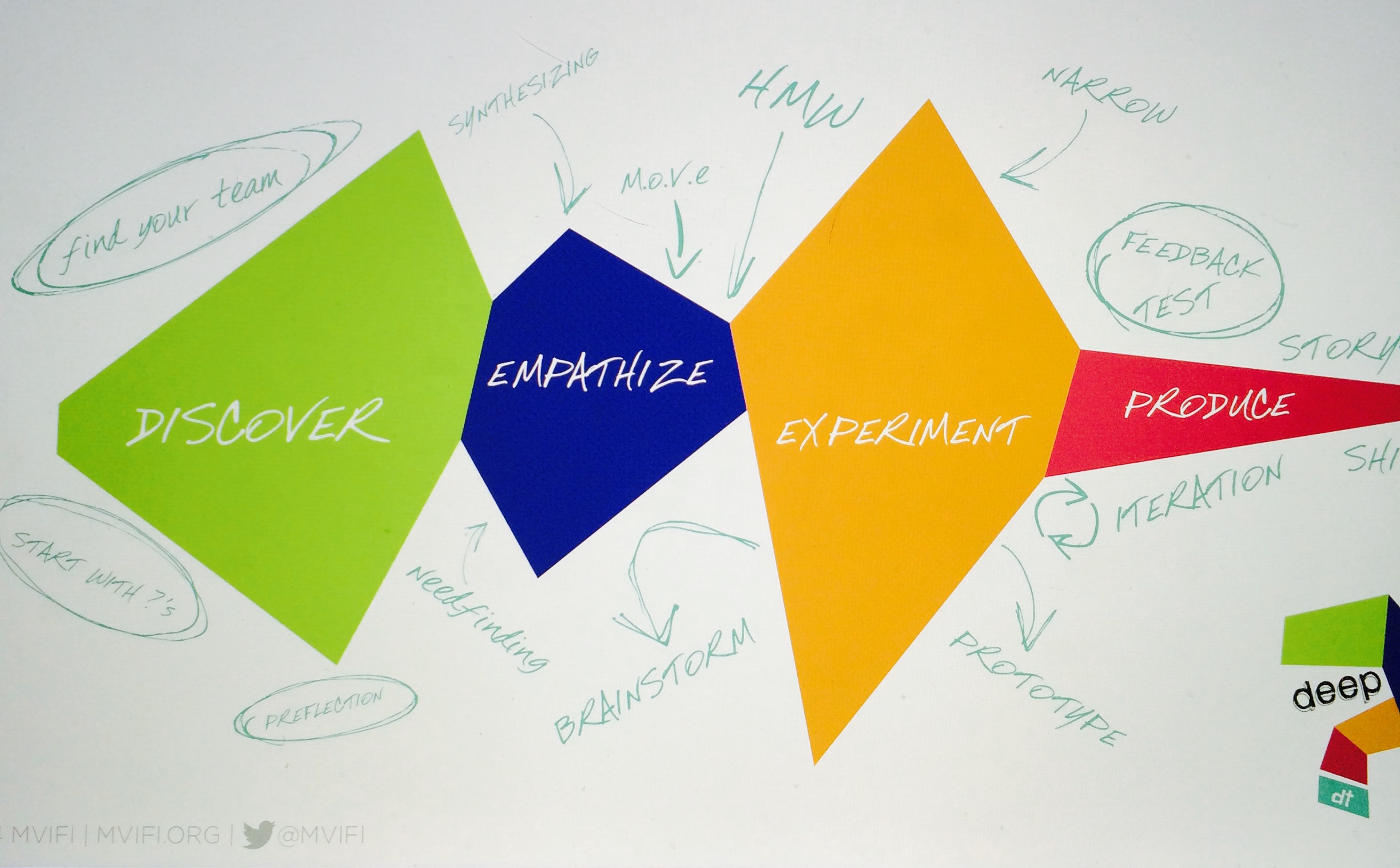
(This post was written April 2015, links updated) In my never ending quest to settle on a design scheme/logo/"brand" for DEEPdt, I went back to the drawing board (literally). The Stanford d. School uses the phrase "Flare & Focus" and it is a really good way to describe and visualize various moments in the process of design thinking. Taking this as an inspiration, I think of DEEPdt as an Ebb & Flow or a Chunk & Narrow (just like Flare & Focus). On a flight to SXSWedu on March 2, 2014, I shared with Trey Boden my visual sketch designs of the DEEPdt process (see below sketches). After a few iterations, Trey drew the below design via Illustrator based off of my drawings and concept of The Mess of DEEPdt. I think he did a great job capturing ideas and my sketches. The Ebb & Flow design concept is the design utilized in the DEEPdt Playbook (which I am a co-author of when I was Director for the Center for Design Thinking.)


This morning, like most Saturdays, I awoke with a creative itch. For some reason the idea of designing a New logo for DEEPdt has been on my brain this week and well this morning, I wanted to try to design it. So I did.
So where to begin? I googled images for pulse rate, life line, and heart beat (I watched Grey's Anatomy last night if that gives you any insight into my thinking). Images like below got me thinking of peaks and valleys throughout the process of DEEP design thinking. Then I remembered the similarities of my sketches to the movement of these images. They are not static, not uniform, instead fluid, irregular, connected.


In thinking of the Ebb & Flow, reviewing my sketches, and really wondering about empathy, process, and people, it all just sort of made sense. If I want to redesign the logo of DEEPdt, well what a cool way to make a logo meaningful & full of depth. It is abstract enough to be interpreted in may ways, yet can be explained and demonstrated through the experience of the DEEPdt process. I am no graphic designer. I am though confident to know that I can create something, share it, and be okay if it is not perfectly "graphic designer" made. As I have done since day one of creating DEEPdt: put it into the hands of Users, test it, collect feedback, iterate it, and throw it back into the peanut gallery for more love & understanding. As an educator I feel it is very important to model and demonstrate this type of iterative learning and shipping of ideas. An aspect to growth of learning is showing your learning especially in the middle of the "mess".
Along with New Logo, a New Tag line: human-centered approach to learning, creating, and being through Empathy.
In case there are any Auburn University fans, yes the color palette is War Eagle proud. In thinking of color schemes, I figured, "Go with the colors you love Mary." For the last three years, AU colors (not school) have been my utmost favorite combos. I am hoping they will add their complimentary colors soon as I have the "itch" to keep creating for DEEPdt. Fonts used: Railway Regular & Hand Test Regular. As for logo's, I am pretty excited about this one for now... Yet who knows? Tomorrow, I might just want to redesign it again and I just may.

